Don’t Look at Vending Machines
March 23rd, 2017
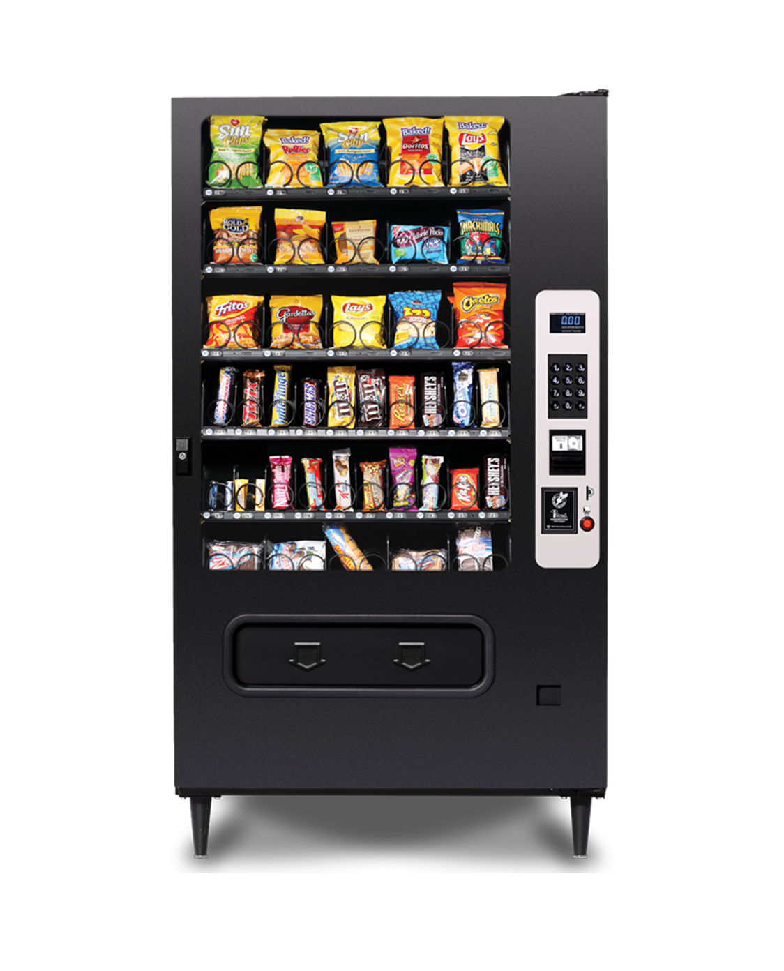
This is going to be about looking at competition, but first let’s talk about vending machines. Vending machines are the worst. While I rarely make use of them, anytime I resort to getting a drink or a snack from one, I’m reminded of just how terrible they are. Attempting to scan through all of the options is stressful in and of itself, but the anxiety worsens when there’s a line forming behind you.

When you finally decide on your snack, you have to remember the code beneath it and punch it in on the keypad off to the right. Despite the code almost never being longer than 4 digits, you look back and forth between the code and the keypad as you slowly type it in one by one out of fear of accidentally ordering a Snickers when you actually want a KitKat. And these things can never be trusted, so when you’re typing in the code and frantically looking back at your snack to confirm the code, you also have to look at the display screen to ensure you’ve actually typed it in correctly.
Upon submitting your entry, you step back in anticipation with your fingers crossed as your snack slowly uncoils, praying it doesn’t get stuck. There’s a strange sense of satisfaction in seeing and hearing your snack crash to the bottom of this machine despite the reality of having to shovel it out of this cavernous pit of crumbs. But that doesn’t matter—you have your snack, and you can now escape this hell known vending machine experience.
Now imagine you’re tasked with redesigning a vending machine. You may start with looking at vending machines to understand their basic functionalities, but you damn well better get out of there as soon as you can because the more you look at that vending machine the more your subconscious is going to create an expectation of what a vending machine is or how they should work. We just relived the misery of the vending machine experience, so in redesigning one they’re the last place you should be looking.
While showcasing local competition in The Process of Branding Common Kin Bakery article, I wrote:
A paradox designers often succumb to is that in focusing so intently on being “different” from their competition, they indirectly follow the same trends and structures of those they’re trying to differ from. However, we’re deliberate to only make a brief note of the competition which exists so we simply know what exists.
Then we forget about them—because we believe a brand isn’t built on the sake of being different, but rather on the values, goals, and needs of the business itself.
I should note that I do believe being different is important, however, I’ve found that by first setting out on such a quest, you’re more likely to merely restyle what exists rather than entirely rethink an experience. In the case of vending machines, we can completely restyle it, make it look extremely modern and approachable, but if it still maintains the same structure and functions the same, what good have we accomplished if the experience is still miserable?
If you’re redesigning a vending machine, look at the first generation iPod for inspiration. Look at ferris wheels, koi ponds, elevators, arcades, libraries, trains, rug manufacturing factories, anywhere but vending machines! Innovation stems from drawing unexpected connections—the synthesis of different concepts and ideas to create work that’s both novel and useful.
I’m writing about this as a reminder to myself. I just finished researching competition for a client, and now I have to actively remind myself to stop looking at what the competition is doing. It’s tempting to see what standards exist or what conventions have been set, but that’s not where good, innovative design comes from. You can take note of the competition, but start with what you have—your client’s goals and content—and ideate from there.