What font is that?
Please note: This post has been edited and may contain outdated/incorrect information or may even contain ideas/statements I no longer align with.
Over the weekend, I got to thinking about the question of “What font is that?” Across every platform, I always see this question being asked. Unfortunately, it’s rare to ever see an answer. As someone that is not only venturing into the world of the type design, but is also a genuine lover of design and typography, it’s very discouraging to see this go unanswered. I recently saw a post pop up on my twitter feed which read something along the lines of, “‘What font is that?’ is the new ‘What lens did you use?’” which was followed up by “Stop asking, start doing. If you can’t execute it really doesn’t matter what typeface or lens you use.”
While I understand the perspective this is coming from, I don’t necessarily agree with it. The reason I bring it up at all is because you rarely see designers crediting the type in use or answering the question of “What font is that?” but yet it doesn’t matter what typeface you use? If it doesn’t matter then why do you care if someone else wants to use that typeface? It’s easy to say it doesn’t matter, but does it not? Of course, typography is nuanced and requires a particular set of skills, but a good typeface can immediately elevate a project, which isn’t to say that it inherently will either.
I not only encourage others to ask the question of “What font is that?” but to also answer the question when asked and to credit their type in use whenever possible, as all of this allows us to push typography forward. There’s value in your typographic decisions, and to suggest that the type designers work and vision that you’re leveraging doesn’t matter doesn’t make you some enlightened designer, it makes you an ass. (I should note here, I’m not calling that person who wrote that tweet an ass. I have no idea who they are. Just saying we should all get off our designer high horse every so often—myself included.)
On that note, here’s a small list of type foundries you may or may not know about to help you step up your typeface game.
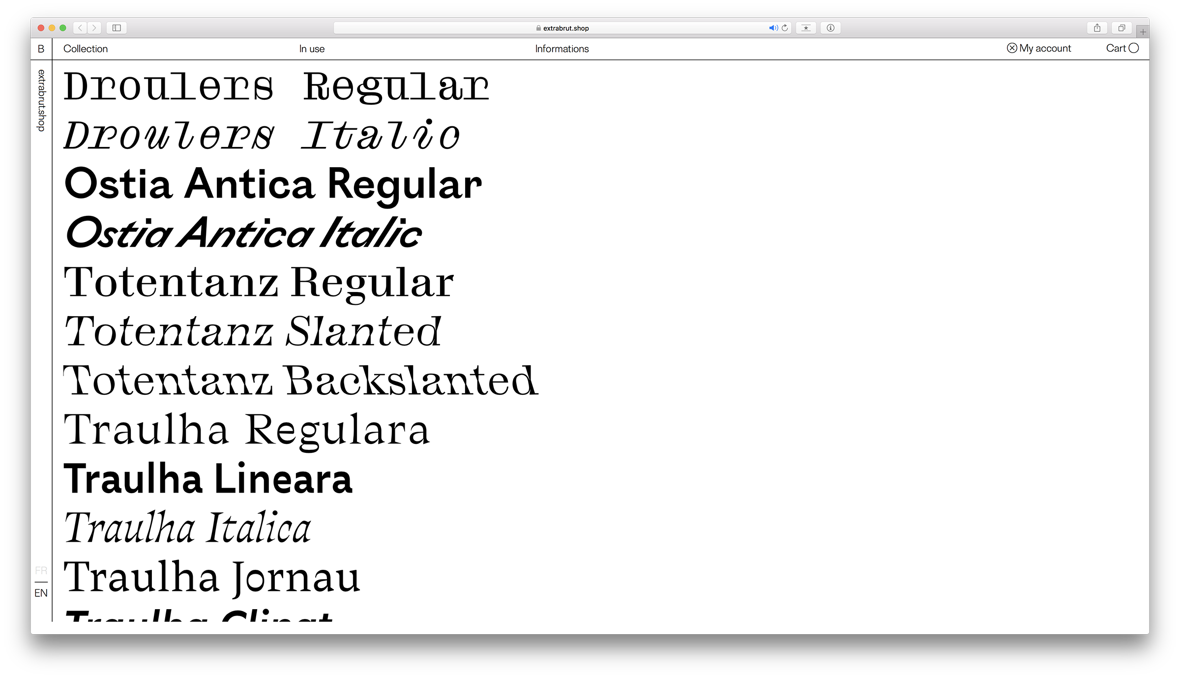
Bureau Brut is the design studio and type foundry of Julia Joffre, Yoann Minet and Camille Prandi. Strange yet delightful, all of their typefaces offer their own set of surprises and manage to cut through any bit of dryness. The whole Traulha family is easily one of my favorites.
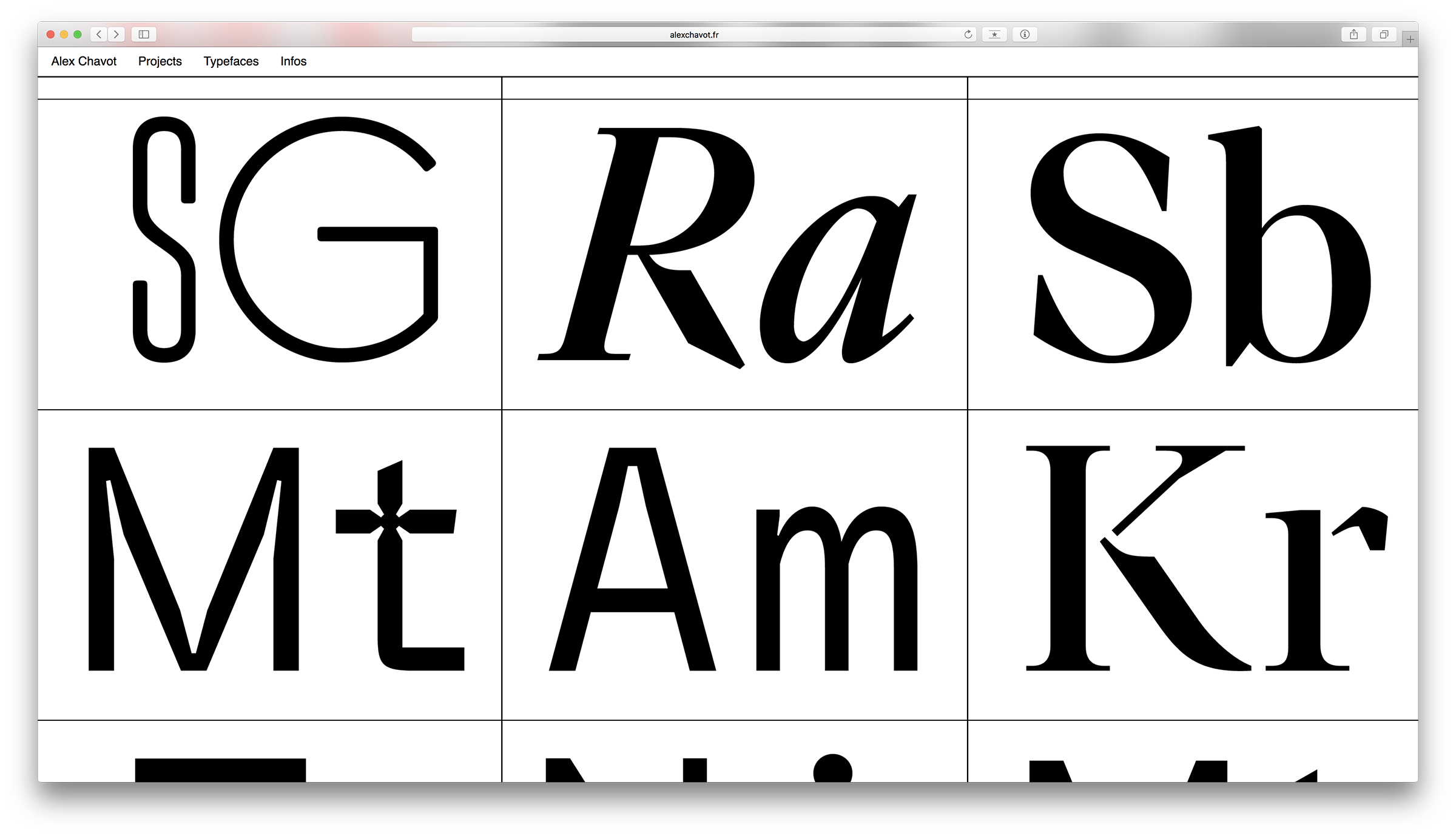
Alex Chavot is a Paris based type designer whose graphic design work I first discovered before his type. I was really intrigued by how Alex handled his typography and was so excited to see he had some typefaces of his own. I think you’ve got to email Alex to buy some of his typefaces, but it’s well worth it.
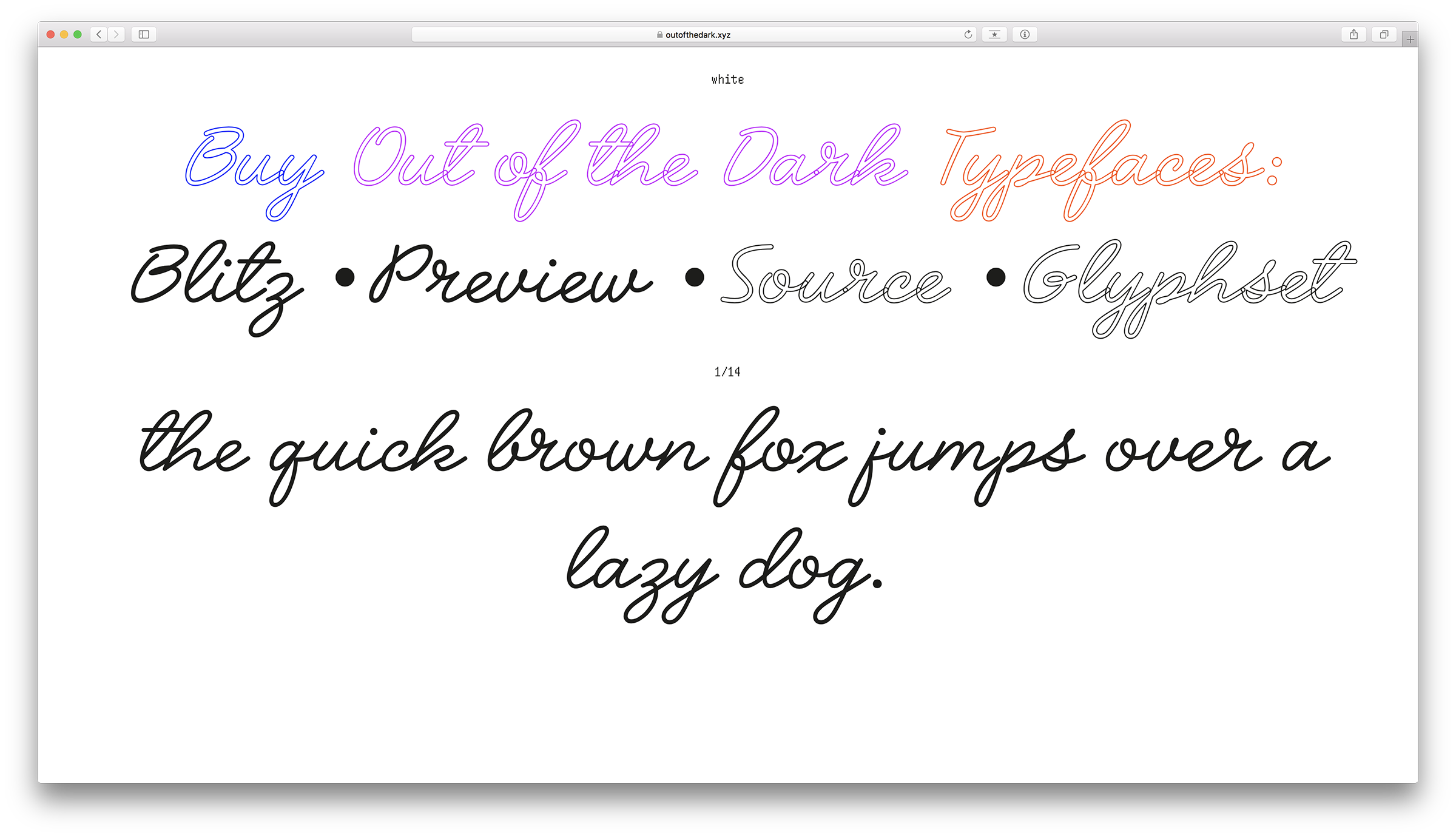
Philipp Herrmann started Out of the Dark back in 2013, but if I can remember correctly it was named something else? I’m not entirely sure, and that’s beside the point. Philipp has some crazy typefaces, Crack and GZA are my favorites. Oh, and I’ll just let you figure out how to navigate the site.
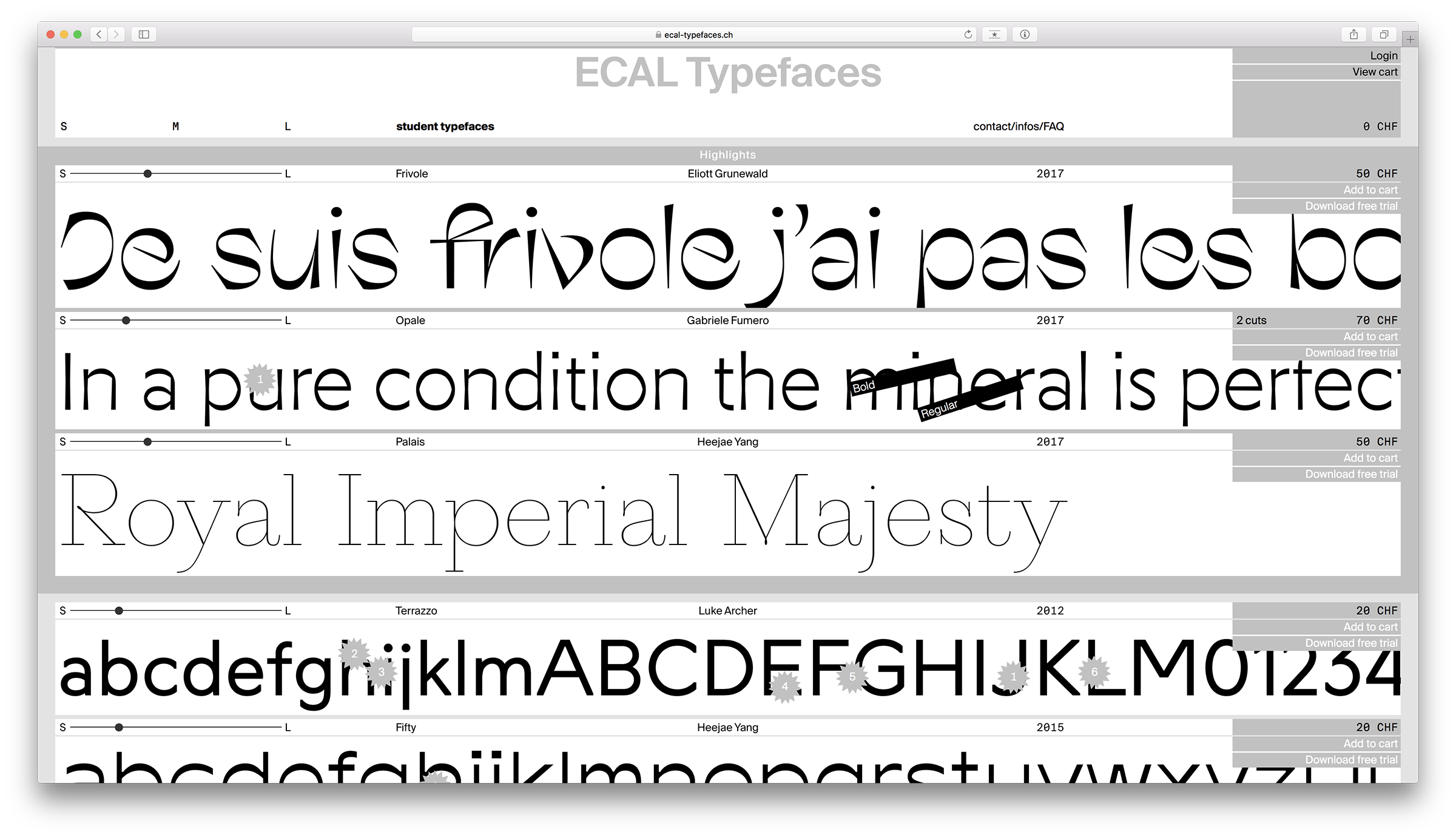
ECAL is so damn cool. First off, just read this little description: “With this website initiated with Swiss Typefaces, ECAL/University of Art and Design Lausanne is probably the first university in the world to have launched an online type foundry, allowing direct access for anyone to a selection of typefaces, all designed by students.” Some of the most interesting work right now in type design is being done by students and ECAL is a testament to this. Picara by Sandra Carrera makes me angry because I love it so much.
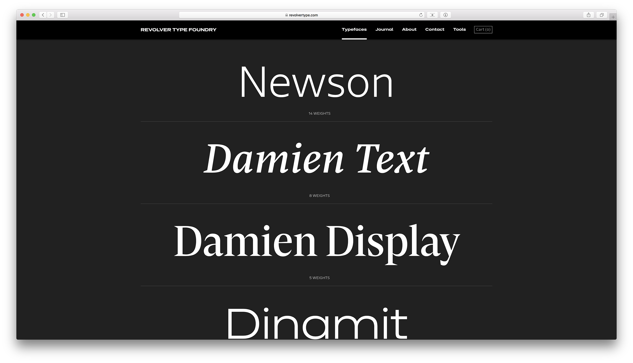
Revolver Type Foundry is a fairly new foundry by Lukas Schneider. Damien text and display are a killer combination—I especially love their italics. On the sans side, Dinamit is super rad. While it’s pretty wide, it still feels quite round, and damn I love that lowercase “s.”
That’s all for now. Go buy some rad fonts, and maybe make some rad stuff.