Montecatini Pro
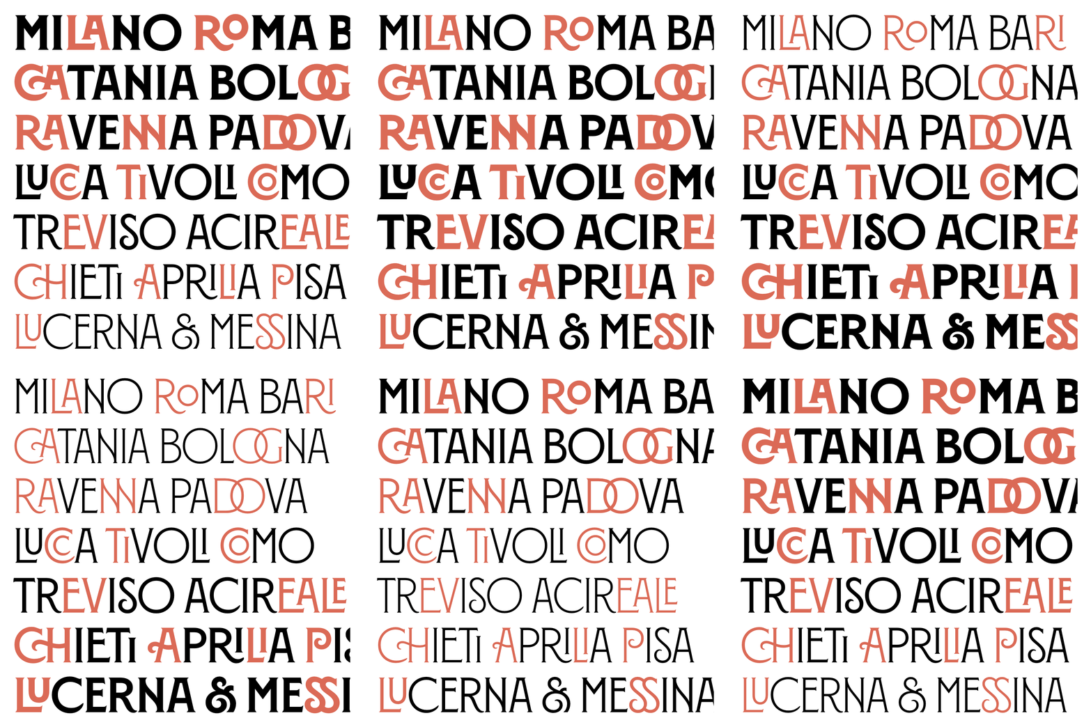
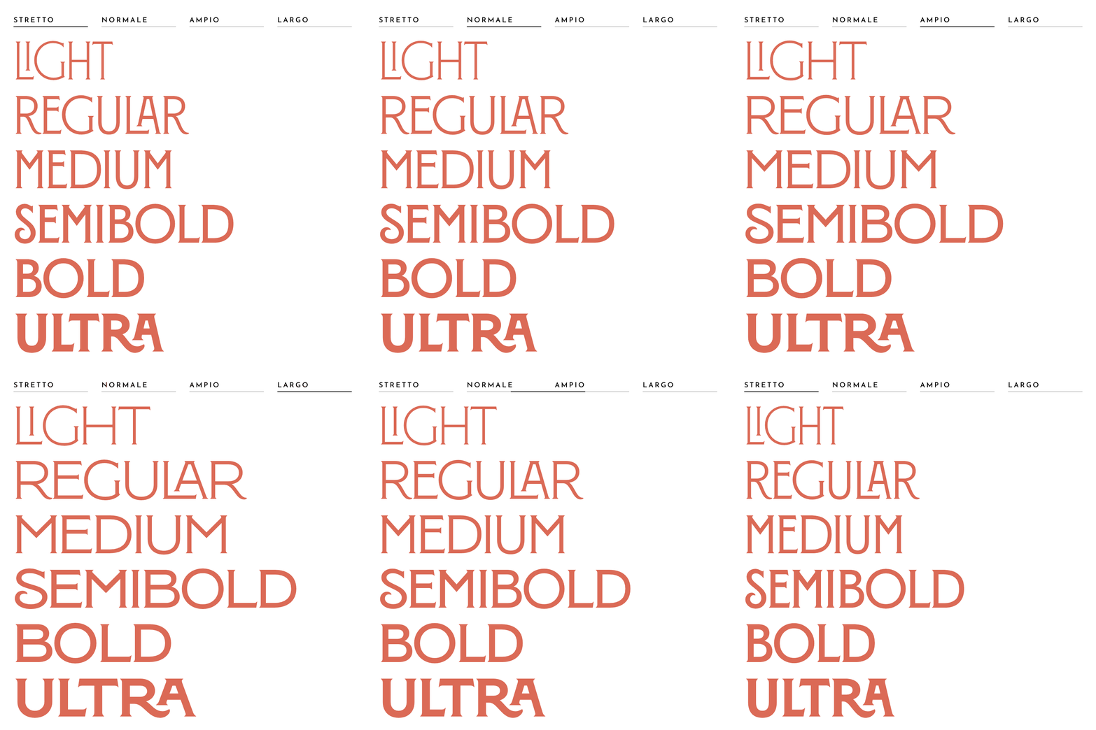
Leading into the launch of Montecatini Pro, which expanded Montecatini in 24 styles, spanning 6 weights and 4 widths, Andy and I initialized the idea of building a minisite to better promote the new family.
Not only was Andy responsible for the expansion of Montecatini Pro, but he also led the way on designing the site. My skills largely came into play when it came to actually developing the site. The biggest hurdle and perhaps my proudest accomplishment is that it exists entirely on our Squarespace site!
Second to that is the site’s header, which presented a fun opportunity to play with variable fonts and showcase Montecatini’s new design space. The screenshot below doesn’t show it off, but you can play with it on the live site.

↑ Scroll on the site above to preview the minisite! Or view it live on louisefili.com/montecatini-pro.
Montecatini is largely known for it’s wonderful use of ligatures and contextual alternates, however, as we launched the pro version, MyFonts (where we sell the fonts) updated their site which no longer automatically shows contextual alternates. (AHHHH!) Thankfully we had built out the minisite (which also increased tripled our site traffic!).
In addition to the minisite, I created some fun animations using DrawBot to use as promotional material.

